반응형을 위한 breakpoint 입니다.
일정 너비 이상 혹은 이하가 됐을 때, 컴포넌트의 속성을 바꾸어 화면에 맞게 조절하는 것이죠!
이때의 일정 너비가 breakpoint 인 것입니다. 😄
https://mui.com/material-ui/customization/breakpoints/
Breakpoints - Material UI
API that enables the use of breakpoints in a wide variety of contexts.
mui.com
00. Default breakpoints

메테리얼 디자인의 breakpoint 기본값입니다.
xs, sm, md, lg, xl 로 너비가 나누어져 있습니다.
01. breakpoints 커스터마이징
물론! 커스터마이징 가능합니다🔥🔥
https://avoc-o-d.tistory.com/45
[Material Design] Material-UI(MUI)로 react & styled component 사용하기 <기본 theme를 커스터마이징하기>
https://mui.com/material-ui/customization/theming/ Theming - Material UI Customize MUI with your theme. You can change the colors, the typography and much more. mui.com theme를 정의하면, 컴포넌트를..
avoc-o-d.tistory.com
const theme = createTheme({
  breakpoints: {
  /** 아래 숫자들을 본인의 프로젝트에 맞게 설정하세요 */
    values: {
      xs: 0,
      sm: 600,
      md: 900,
      lg: 1200,
      xl: 1536,
    },
  },
});
꼭 xs, sm, md, lg, xl 가 아니고, 아래처럼 자유로이 이름을 정할 수 있습니다!
const theme = createTheme({
  breakpoints: {
    values: {
      mobile: 0,
      tablet: 640,
      laptop: 1024,
      desktop: 1200,
    },
  },
});
02. 적용
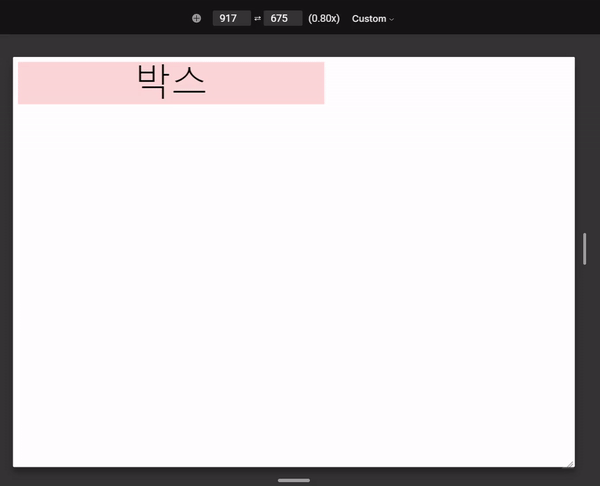
위 예시 코드입니다.
md(900px) 이상일 땐 박스의 너비가 50rem
sm(600px) 이상이고, md(900px) 이하일 땐 박스의 너비가 24rem
xs(0px) 이상이고, sm(600px) 이하일 땐 박스의 너비가 15rem
가 되도록 작성하였습니다.
import "./styles.css";
import React from "react";
import { Box, Typography } from "@mui/material";
import { useTheme } from "@mui/material/styles";

export default function App() {
  /**
   * (반응형) breakPoints에 따라 HTML에 적용하는 스타일을 전환하도록 함.
   *
   * useTheme : 현재 정의한 테마를 리턴하는 hook
   * - 현재 정의한 breakPoints에 접근 가능
   */
  const theme = useTheme();

  const boxSx = {
    backgroundColor: "#FFDAD6",
    [theme.breakpoints.down("sm") && theme.breakpoints.up("xs")]: {
      width: "15rem"
    },
    [theme.breakpoints.down("md") && theme.breakpoints.up("sm")]: {
      width: "24rem"
    },
    [theme.breakpoints.up("md")]: { width: "50rem" }
  };
  return (
    <div className="App">
      <Box sx={boxSx}>
        <Typography variant="h1">박스</Typography>
      </Box>
    </div>
  );
}

위 예시 코드입니다.
md(900px) 이상일 땐 row방향(가로)
md(900px) 이하일 땐 column방향(세로)
으로 쌓이도록 작성하였습니다.
import "./styles.css";
import React from "react";
import { Box, Typography } from "@mui/material";
import { useTheme } from "@mui/material/styles";

export default function App() {
  /**
   * (반응형) breakPoints에 따라 HTML에 적용하는 스타일을 전환하도록 함.
   *
   * useTheme : 현재 정의한 테마를 리턴하는 hook
   * - 현재 정의한 breakPoints에 접근 가능
   */
  const theme = useTheme();

  const boxSx = {
    display: "flex",
    gap: (theme) => theme.spacing(4),
    [theme.breakpoints.down("md")]: {
      flexDirection: "column"
    },
    [theme.breakpoints.up("md")]: { flexDirection: "row" }
  };
  return (
    <div className="App">
      <Box sx={boxSx}>
        <Typography variant="h1">Item1</Typography>
        <Typography variant="h1">Item2</Typography>
        <Typography variant="h1">Item3</Typography>
        <Typography variant="h1">Item4</Typography>
      </Box>
    </div>
  );
}
🤩반응형~🤩