간편하게 반응형 크기를 설정해봅시다!
위 예시 코드입니다.
index.js
import { StrictMode } from "react";
import { createRoot } from "react-dom/client";
import App from "./App";

import "./styles.css";
import { createGlobalStyle } from "styled-components";

const GlobalStyles = createGlobalStyle`
  html {
    font-size: 62.5%;
  }
`;

const rootElement = document.getElementById("root");
const root = createRoot(rootElement);
root.render(
  <StrictMode>
    <GlobalStyles />
    <App />
  </StrictMode>
);
App.js
import "./styles.css";
import React from "react";
import Typography from "@mui/material/Typography";
import {
createTheme,
ThemeProvider,
responsiveFontSizes
} from "@mui/material/styles";
let theme = createTheme({
typography: {
fontFamily: "Noto Sans KR",
htmlFontSize: 10
}
});
/**
* (반응형) 사용자가 정의한 theme의 글꼴 크기가 화면 크기에 맞게 변해야 함.
* 따라서, responsiveFontSizes로 theme를 감싸줌.
*/
theme = responsiveFontSizes(theme);
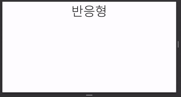
export default function App() {
return (
<ThemeProvider theme={theme}>
<div className="App">
<Typography variant="h1">반응형</Typography>
</div>
</ThemeProvider>
);
}
00. rem
https://www.sitepoint.com/understanding-and-using-rem-units-in-css/
Rem in CSS: Understanding and Using rem Units - SitePoint
Adrian Sandu explains the purpose and advantages of rem units, demonstrating ways to use em and rem units in CSS layouts.
www.sitepoint.com
font size를 일관성 있게 정하기 위해선, rem 단위를 써줘야 합니다. rem이란 root 크기에 의존한 단위입니다. (root는 html입니다.)
그런데 현재 root의 defalut크기는 16px입니다. 그래서 10px을 rem으로 표현하기 위해선 16으로 나눈 0.625rem을 써줘야 합니다. 그런데.. 16으로 나누기 귀찮잖아요. 아예 rem으로 표현하기 편하게 바꿔줍시다!🔥
html의 defalut font-size입니다. 그래서 16px 인 것이죠.
html {
    font-size: 100%;
}
그럼 10px을 표현하기 위해 0.625rem 대신, (비교적 쉽게 10으로 나눈) 1.0rem을 써주기 위해선 아래처럼 설정해줍니다.
html {
  font-size: 62.5%; /* 62.5% of 16px = 10px */
}
index.js에 createGlobalStyle으로 적용한 모습입니다.
import { StrictMode } from "react";
import { createRoot } from "react-dom/client";
import App from "./App";

import "./styles.css";
import { createGlobalStyle } from "styled-components";

const GlobalStyles = createGlobalStyle`
  html {
    font-size: 62.5%;
  }
`;

const rootElement = document.getElementById("root");
const root = createRoot(rootElement);
root.render(
  <StrictMode>
    <GlobalStyles />
    <App />
  </StrictMode>
);
01. theme
https://mui.com/material-ui/customization/typography/
Typography - Material UI
The theme provides a set of type sizes that work well together, and also with the layout grid.
mui.com
htmlFontSize를 10으로 설정합니다.
const theme = createTheme({
  typography: {
    // Tell MUI what's the font-size on the html element is.
    htmlFontSize: 10,
  },
});
그 후, 사용자가 정의한 theme 글꼴 크기가 반응형이 적용되도록 responsiveFontSizes로 theme를 감싸줍니다.
/**
 * (반응형) 사용자가 정의한 theme의 글꼴 크기가 화면 크기에 맞게 변해야 함.
 * 따라서, responsiveFontSizes로 theme를 감싸줌.
 */
theme = responsiveFontSizes(theme);
마지막으로 theme를 인자로 넘겨준 ThemeProvider로 컴포넌트를 감싸줍니다.
https://avoc-o-d.tistory.com/45
[Material Design] Material-UI(MUI)로 react & styled component 사용하기 <기본 theme를 커스터마이징하기>
https://mui.com/material-ui/customization/theming/ Theming - Material UI Customize MUI with your theme. You can change the colors, the typography and much more. mui.com theme를 정의하면, 컴포넌트를..
avoc-o-d.tistory.com
02. 적용
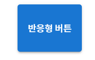
width, height 등등 크기를 정해줘야하는 단위들은 rem으로 사용해줍니다.
위 예시는 height가 7.2rem(72px)을 적용한 버튼입니다.
import "./styles.css";
import React from "react";
import Button from "@mui/material/Button";
import {
  createTheme,
  ThemeProvider,
  responsiveFontSizes
} from "@mui/material/styles";

let theme = createTheme({
  typography: {
    fontFamily: "Noto Sans KR",
    htmlFontSize: 10
  }
});
/**
 * (반응형) 사용자가 정의한 theme의 글꼴 크기가 화면 크기에 맞게 변해야 함.
 * 따라서, responsiveFontSizes로 theme를 감싸줌.
 */
theme = responsiveFontSizes(theme);

export default function App() {
  return (
    <ThemeProvider theme={theme}>
      <div className="App">
        <Button variant="contained" sx={{ height: "7.2rem" }}>
          반응형 버튼
        </Button>
      </div>
    </ThemeProvider>
  );
}
그럼 이제 어떤 컴포넌트를 쓰든 메테리얼 디자인에서 제공해주는 컴포넌트에는 반응형이 적용될 것입니다..!!!!