✨ Overriding nested component styles
https://mui.com/material-ui/customization/how-to-customize/
How to customize - Material UI
Learn how to customize Material UI components by taking advantage of different strategies for specific use cases.
mui.com
💡중첩된 컴포넌트 style을 override 하기 위해선
컴포넌트의 css 클래스 이름을 사용해서 CSS selector를 작성 후, 커스텀해주면 됩니다.
예를 들어,
해당 컴포넌트의 클래스 이름이 MuiSlider-thumb 일 때, & .MuiSlider-thumb 라는 CSS selector로 커스텀해줍니다.

<Slider
  defaultValue={30}
  sx={{
    width: 300,
    color: 'success.main',
    '& .MuiSlider-thumb': {
      borderRadius: '1px',
    },
  }}
/>
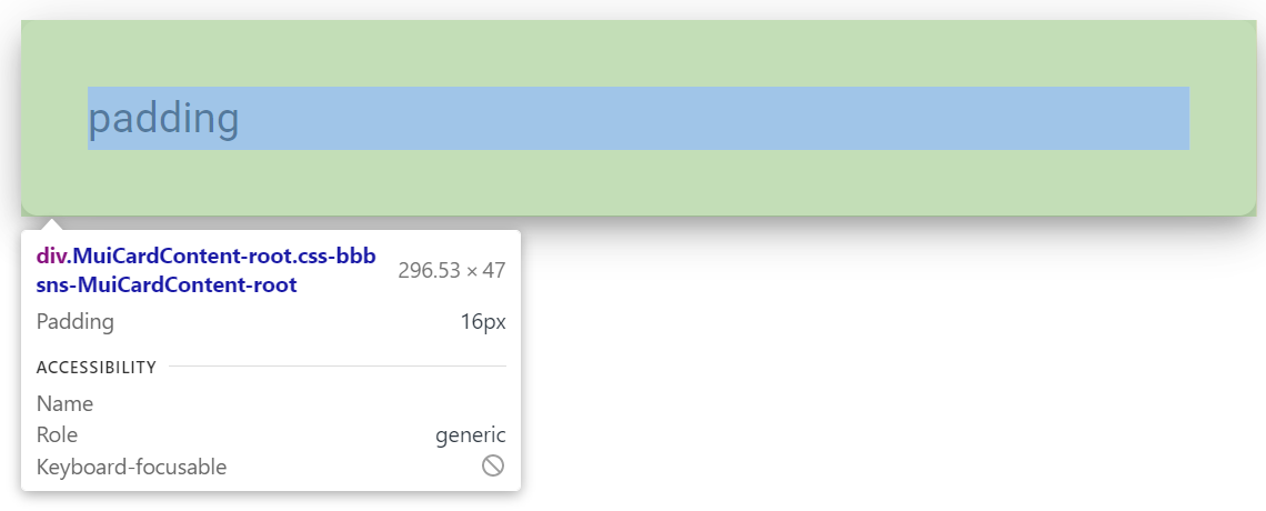
CardContent padding customize
아래와 같은 컴포넌트를 생성했습니다.

import * as React from "react";
import { Card, CardContent, Typography, Box } from "@mui/material";

export default function App() {
  return (
    <Card elevation={5}>
      <CardContent>
        <Box>
          <Typography variant="body1">padding</Typography>
        </Box>
      </CardContent>
    </Card>
  );
}
아! 그런데, 저는 padding-top, padding-bottom 의 크기가 같으면 좋을 것 같아요!


padding-bottom 를 padding-top과 같게 sx 인자로 넘겨 보겠습니다.🤭
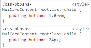
<CardContent sx={{ paddingBottom: "1.6rem" }}>
그치만 그대로네요,,

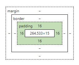
💡 last child selector 의 style이 padding-bottom 이 24px로 고정되어 있기 때문입니다.
override 로 이를 커스터마이징 해주겠습니다.

last-child customize
📍 &:last-child 속성을 이용합니다.
📍 paddingBottom 는 pb 와 동일합니다.
<CardContent sx={{ "&:last-child": { paddingBottom: "1.6rem" } }}><CardContent sx={{ "&:last-child": { pb: "1.6rem" } }}>
결과는?! 커스텀 되었습니다~~!!!😁😁
import * as React from "react";
import { Card, CardContent, Typography, Box } from "@mui/material";

export default function App() {
  return (
    <Card elevation={5}>
      <CardContent sx={{ "&:last-child": { paddingBottom: "1.6rem" } }}>
        <Box>
          <Typography variant="body1">padding</Typography>
        </Box>
      </CardContent>
    </Card>
  );
}